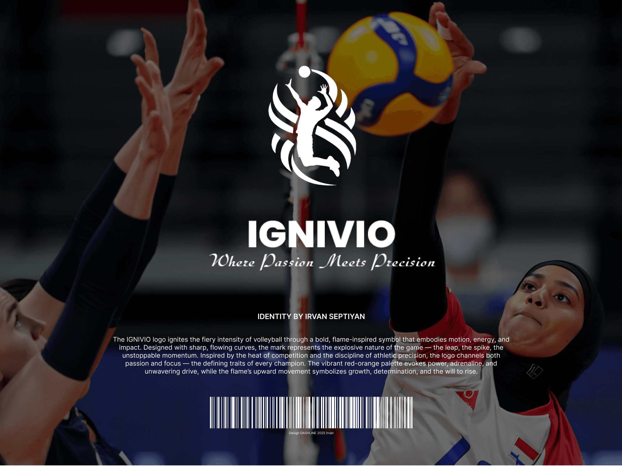
IGNIVIO Volleyball Identity — Energy, Flame, Impact
IGNIVIO was born to ignite the passion and precision of competitive volleyball. With the core message, “Where Passion Meets Precision,” the brand celebrates intensity, discipline, and the energy that drives every spike, serve, and set. IGNIVIO isn’t just a symbol — it’s the fire that fuels excellence on the court.
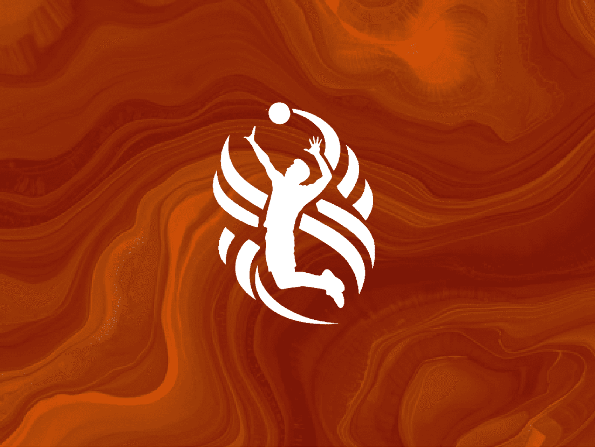
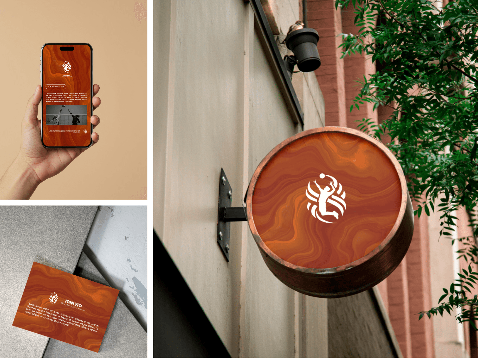
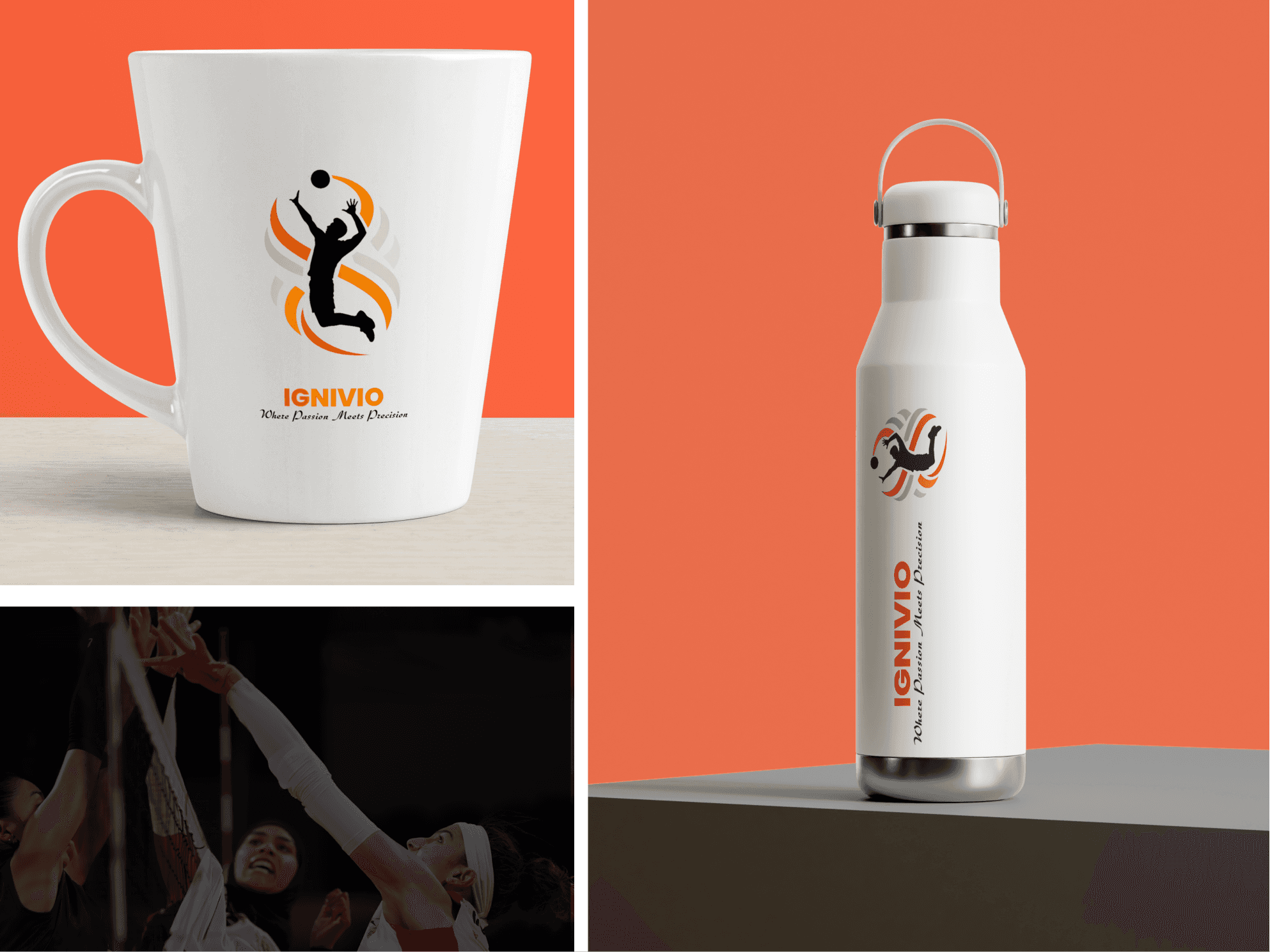
Visual Identity IGNIVIO logo combines a stylized flame with abstract movement lines, creating a symbol of burning passion and upward drive. Designed for adaptability, it appears in various color combinations (red, amber, black/white) for flexible use across gear, media, and digital platforms.
Client
Brand Identity Logo Design
Service Provided
Brand Identity, Logo Presentation, Advertising, Visual Design
The Goal:
The goal was to create a bold, energetic, and empowering brand identity for IGNIVIO — a brand born to ignite the passion and precision of competitive volleyball. The design needed to capture the explosive nature of the sport while delivering a professional and modern look across all brand applications. With the core message “Where Passion Meets Precision,” the identity system was crafted to resonate with athletes, teams, and fans — evoking intensity, focus, and momentum with every visual element.
1
The Challenge:
The challenge was to balance raw athletic energy with a sense of refined precision — translating the fast-paced nature of volleyball into a structured and scalable brand identity. Integrating fire-inspired symbolism without overpowering the visual clarity of the logo required a thoughtful approach to shape, typography, and motion.
2
The Result
The final identity for IGNIVIO reflects the fusion of intensity and control. The logo features dynamic forms and sharp edges that evoke motion, fire, and accuracy — capturing the spirit of a powerful spike or a perfectly timed serve.
3